U Car UX
OVERVIEW / CONTEXT
The aim of this project was to design a native APP for UCar a car rental start-up company. The company specified that the mobile experience must be accessible, easy, and intuitive based on a deep understanding of their target user, behaviours and needs.
The end goal was to design and build a clickable prototype that can be tested with users with a detailed set of wireframes, that can be handed over to both UI designers and then developers.
ROLE
I performed all the roles as a UX/UI Designer using Design Thinking as a methodology.
TASKS
Note-taking (Figma) and Usability test, Affinity diagram (Miro) and User Journey (Miro), User-Flow (Fig-Jam) and Sketching, Prototype (Mid. and High res.), Prototype (Figma) testing and Annotation for developers, Design system and branding (Figma + Adobe Illustrator), WCAG compliance tests.
RESEARCH
Usability test
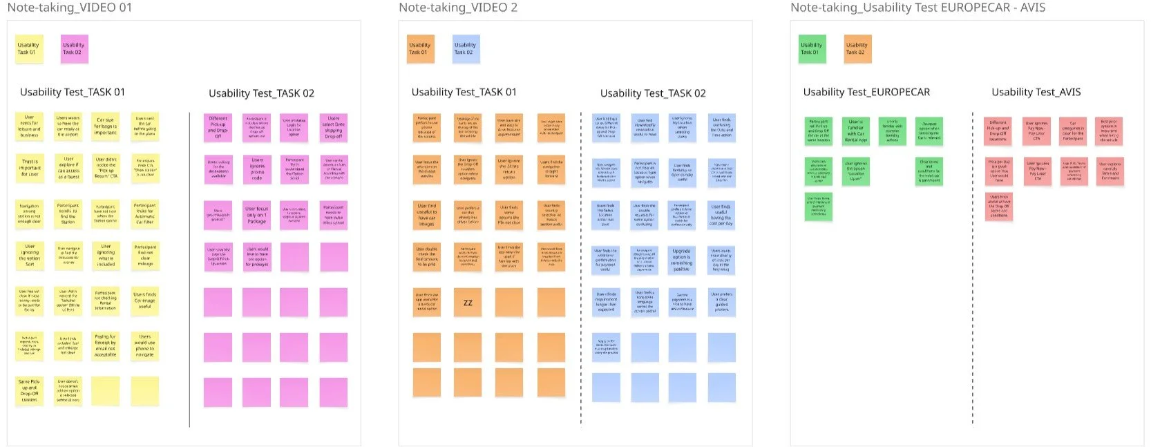
At this stage I’ve conducted two usability tests on one user asking him to interact with two different APPs.
I’ve also implemented the research on usability involving myself in the Note-taking of two previous taken interviews with two different users.
Note taking
Each interview went through a note-taking session to have a better understanding of the Context, Goals, Behaviours and Pain points of the users.
ANALYSIS
Affinity diagram
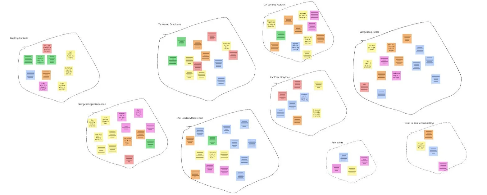
The Affinity Diagram helped me to understand all the information and insights I gathered, in one place. That allowed me to compare and regroup them. The clusters highlighted at this stage have been grouped and named as follows: Booking context, Navigation/Ignored options, Car location/Date rental, Car booking features, Car price/Payment, Terms and conditions, Pain points, Car booking features, Navigation process, Accessibility, Good to have when booking.
Conclusions:
Structure and flow needs to be and simplified
Clearity on costs and hidden potential details
If features or add-ons are to be included they need to be well explained
Design must be more accessible for Vision Impaired users and to not cause any tired eye or distress during the usage
Minimize the number of screens and editable details at any stage.
Customer Journey Map
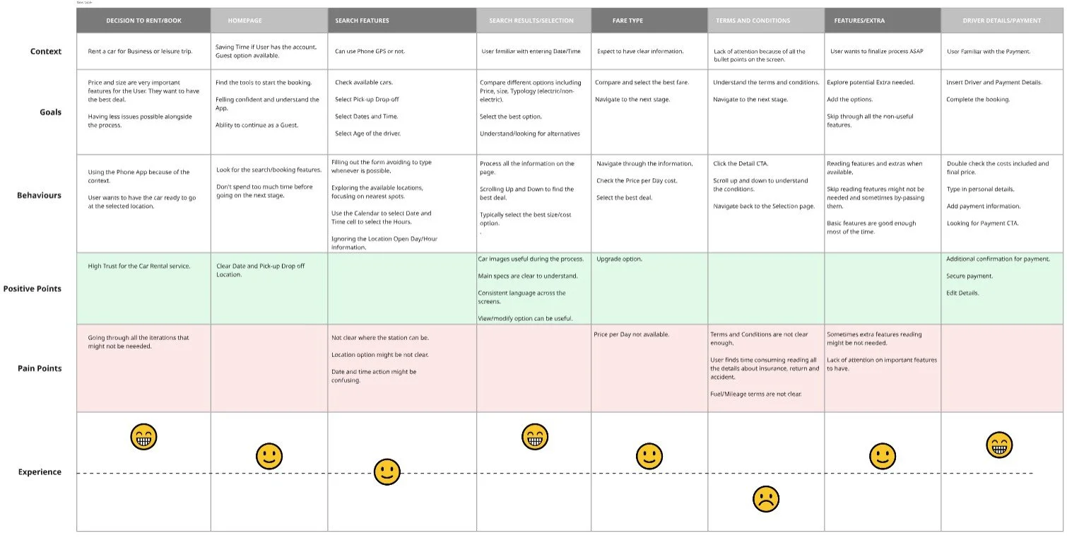
After collating all the data, I went through each step of the user's journey in the booking process with a Customer journey map . I focused the attention on the users goals, behaviours, positive points and pain point in the process.
PROBLEM STATEMENT
The research and analysis sessions highlighted that users find the process not simple and plenty of not needed iterations. There is a request of clearity on some aspects like displaying the location, filling date/time and going to the previous screen without repeating the process from the start.
Details like adds-on and insurance must be displayed clearly and upon request.
The existing APPs are including features that might deliver a non user friendly journey.
CONTEXT
User to book a rental car with different location for Pick-up and Drop-off, and same hours but different dates, Usage of the feature My Location (Permit to share the location, Usage of the feature My Location (Permit to share the location when the User use the APP), No extras, Book with card payment.
DESIGN
User flow
Onto the design stage, and the initial part was to map out User flow through the site. This started at the homepage and finished at the checkout stage. I tried to make the flow as simple as possible while addressing the pain points that were highlighted in the earlier projects. I’ve also split the process in 3 main steps: Reservation, Select Vehicle, Pay and review.
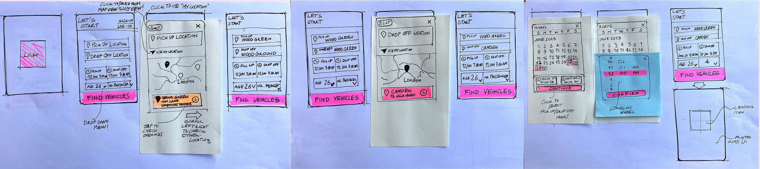
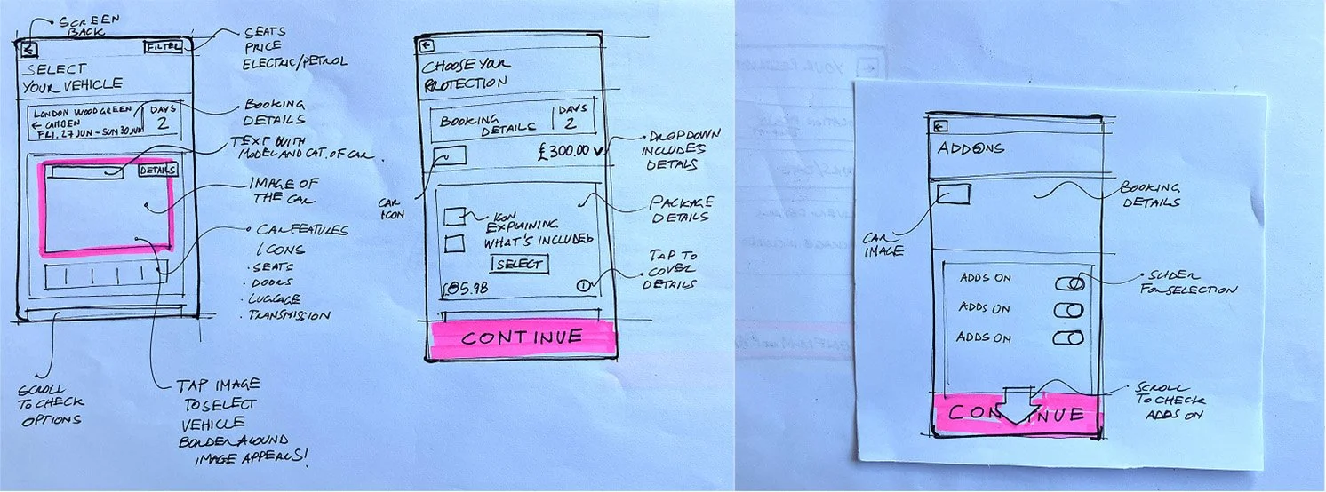
Interaction design / Sketching
The main goal during the sketching sesssion was to conceive interactions and be consistent with the user flow.
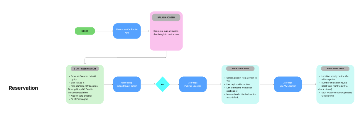
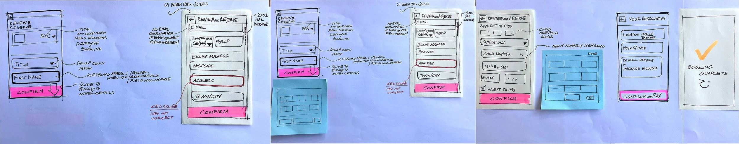
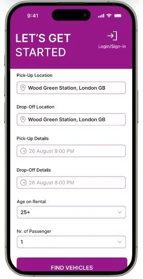
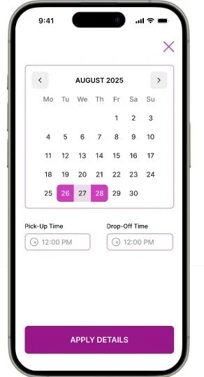
Reservation
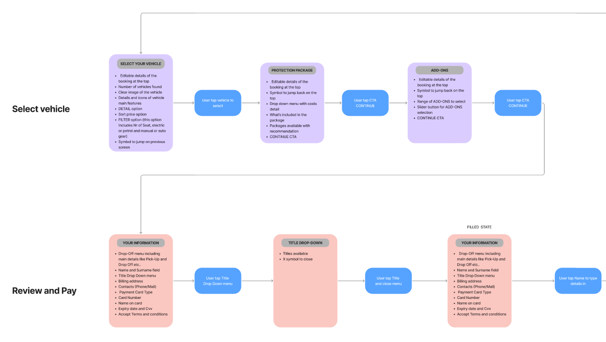
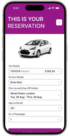
Select vehicle
Review and pay
PROTOTYPE AND VALIDATE
Context
The prototypes have been designed in a context of auto-fill field for details like Name, Surname and preferring to use the “Use my location” option to find the stations.
Prototype Medium-fidelity
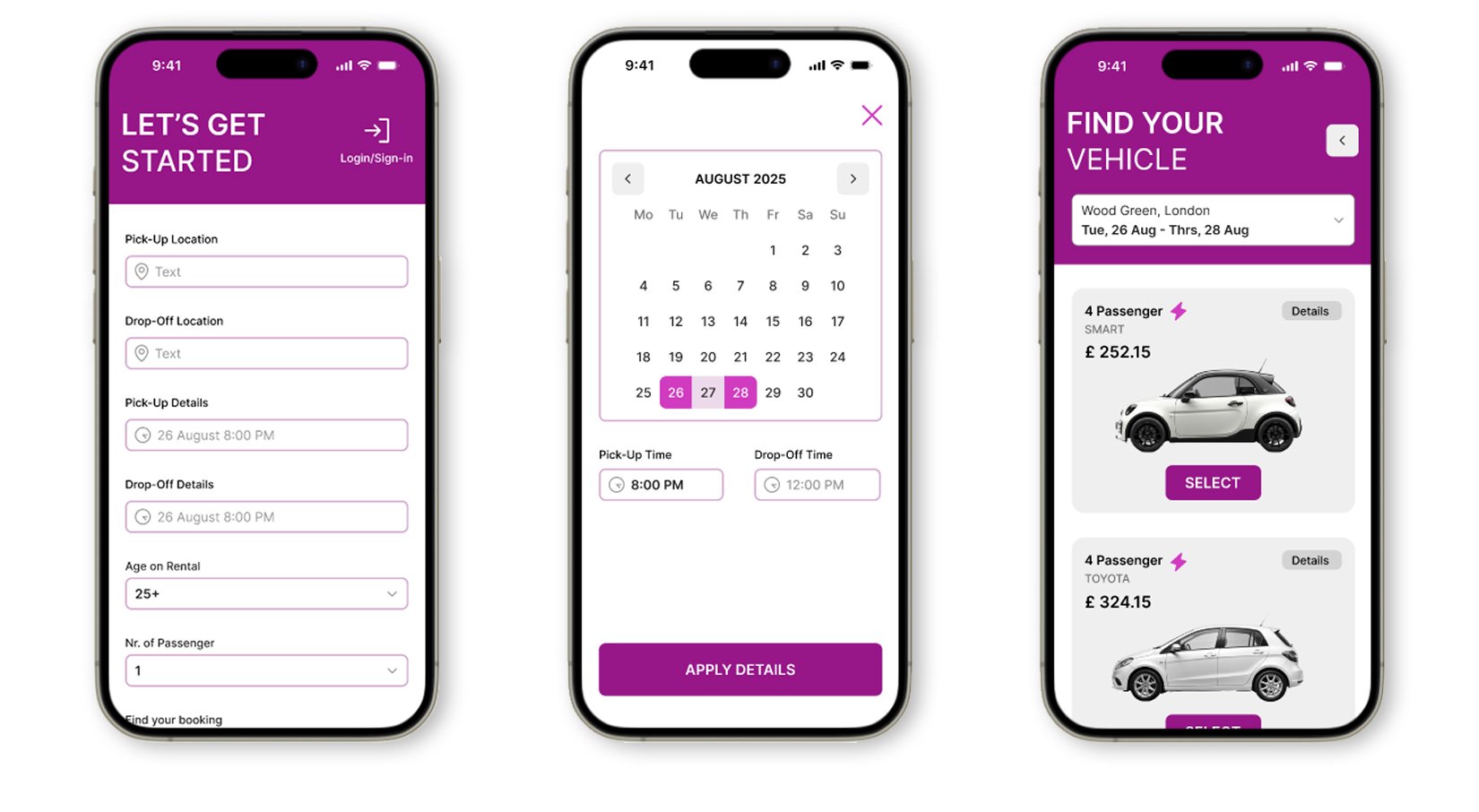
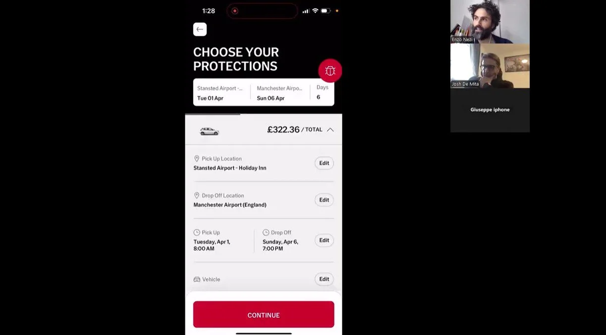
Reservation
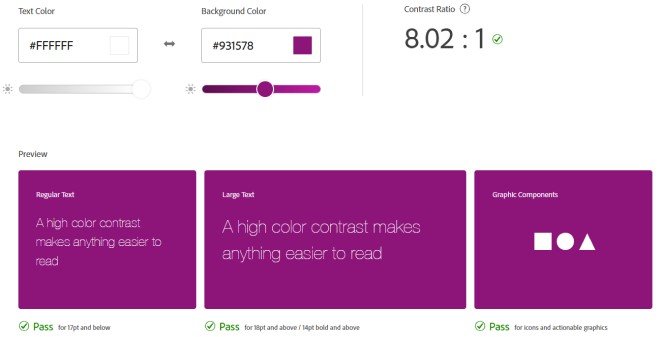
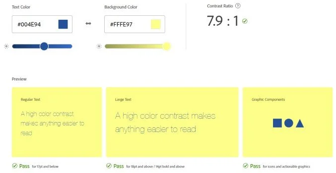
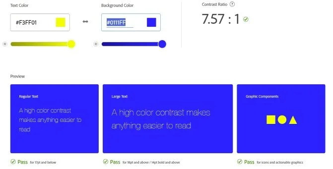
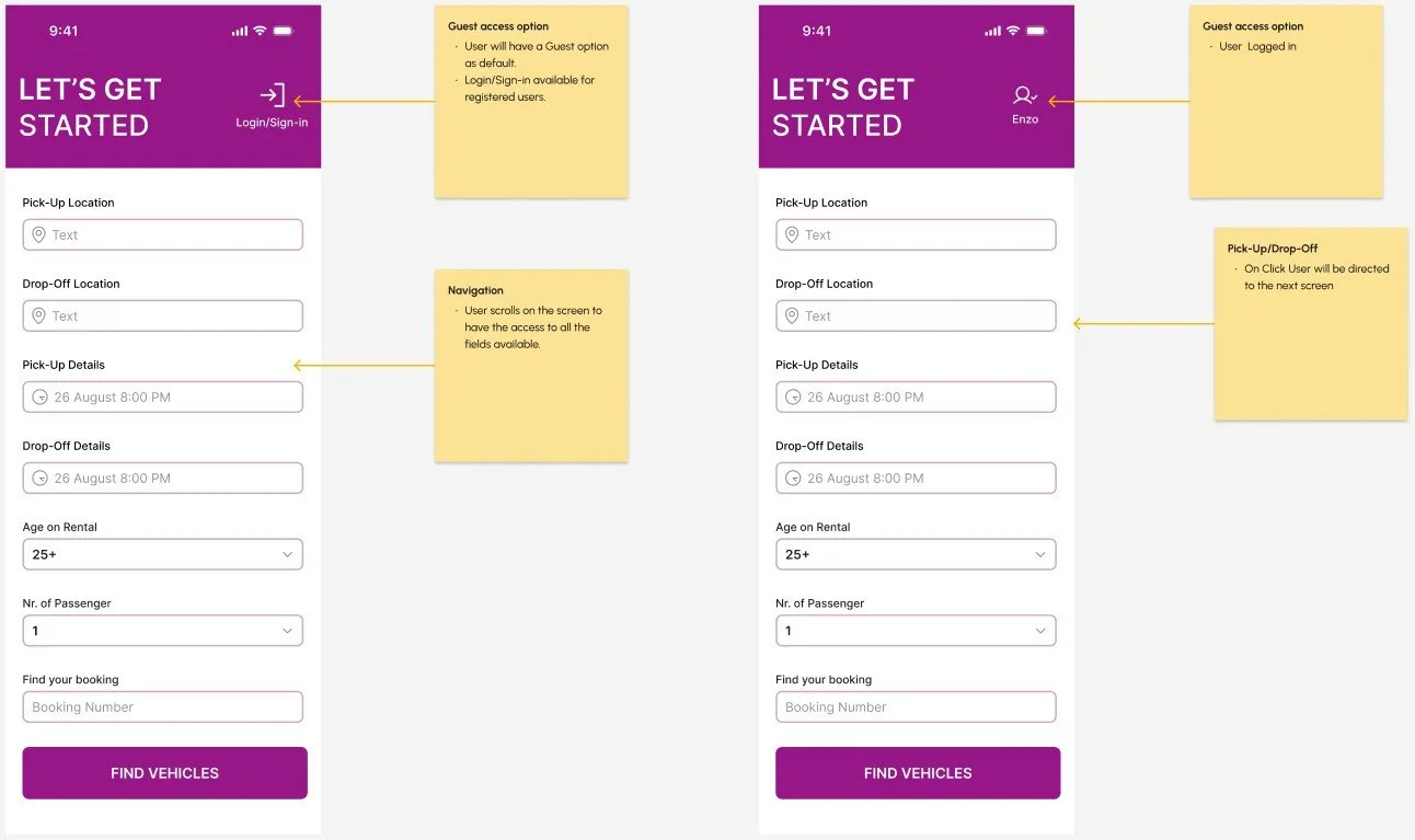
The reservation is the most critical step in the process. I’ve condensed all the information needed for this gate in one screen. I’ve designed the UI following the best practice of accessibility having 18px for CTA, AAA contrast between components and background.
Select vehicle
The information are easy to read and understand. There are drop down menu for Details and a clear summary for the option which user can use as an add-on. User can check and review cost at any time during the process.
Reserve and pay
All the information are condensed in one screen. There are option as a secondary CTA for Apple Pay/Paypal.
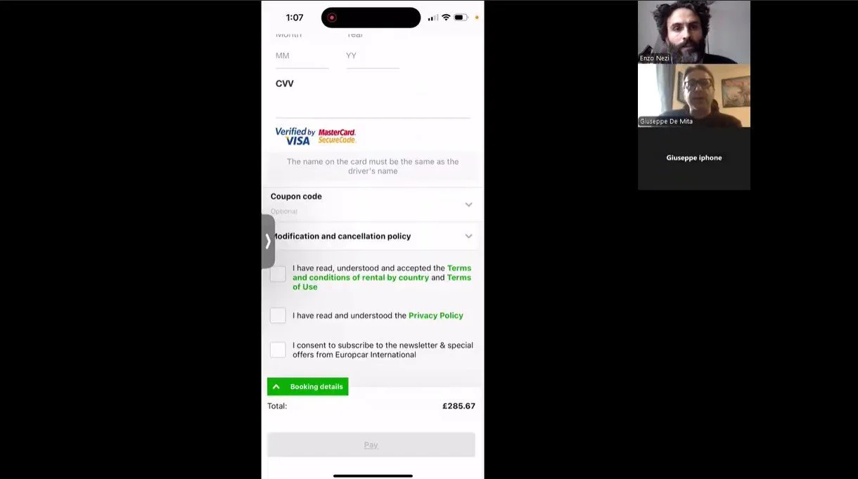
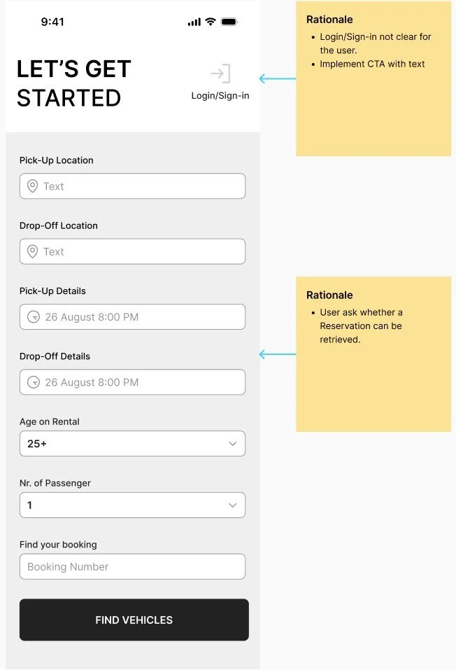
Prototype testing
I’ve conducted two usability tests. One of them has a Vision impaired user for my audience. I went through that stage to be consistent with the insights and finds identified during the Analysis stage.
Conclusions:
Login/Sign-in CTA wad not clear for the user only with the icon.
User asked “How might be if i want to retrieve my reservation either way with or without logging in?”
User finds the entire process simple and intuitive and focus on the main goal: hiring a car.

FINAL PRODUCT
Prototype testing
I’ve conducted an accessibility testing on a vision impaired user making the APP compliant with the WCAG guidelines.
Conclusions:
Find a balance with a priority towards accessibility
Blurry backgrounds and non consistent places for information are not helping the user
User finds distressing vivid colours
User is focused on main CTA and actions to be familiar with the screens
Include 20px text size font.

Design system elements


High-fidelity prototype

All the iterations for the APP went through a precise annotation session. I’ve highlighted in the session the most important features to have like: changing state of the element when preference are selected, transition among the screen to not lose the focus and ease of navigation with gestures.
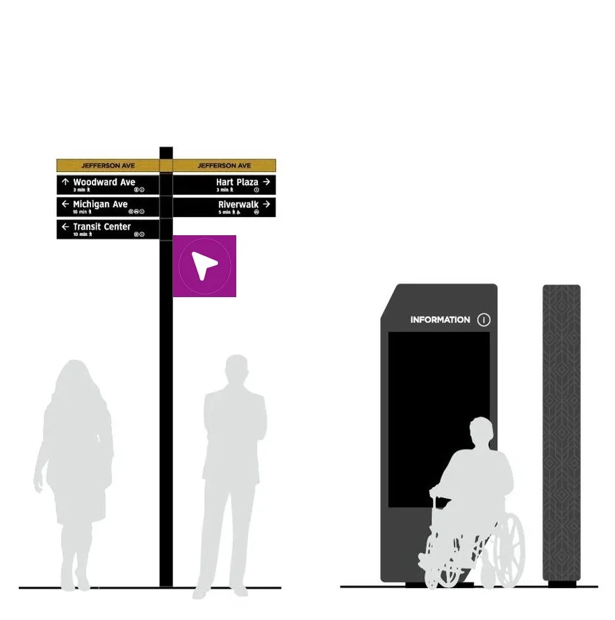
Branding
I conceived the branding of the new APP working in a context where the Logo should have stand out from the competitor and non competitor APP on screen and signages, having full accessibility features to make it readable and recognizable for vision-impaired users, create a link with symbols used for navigation.